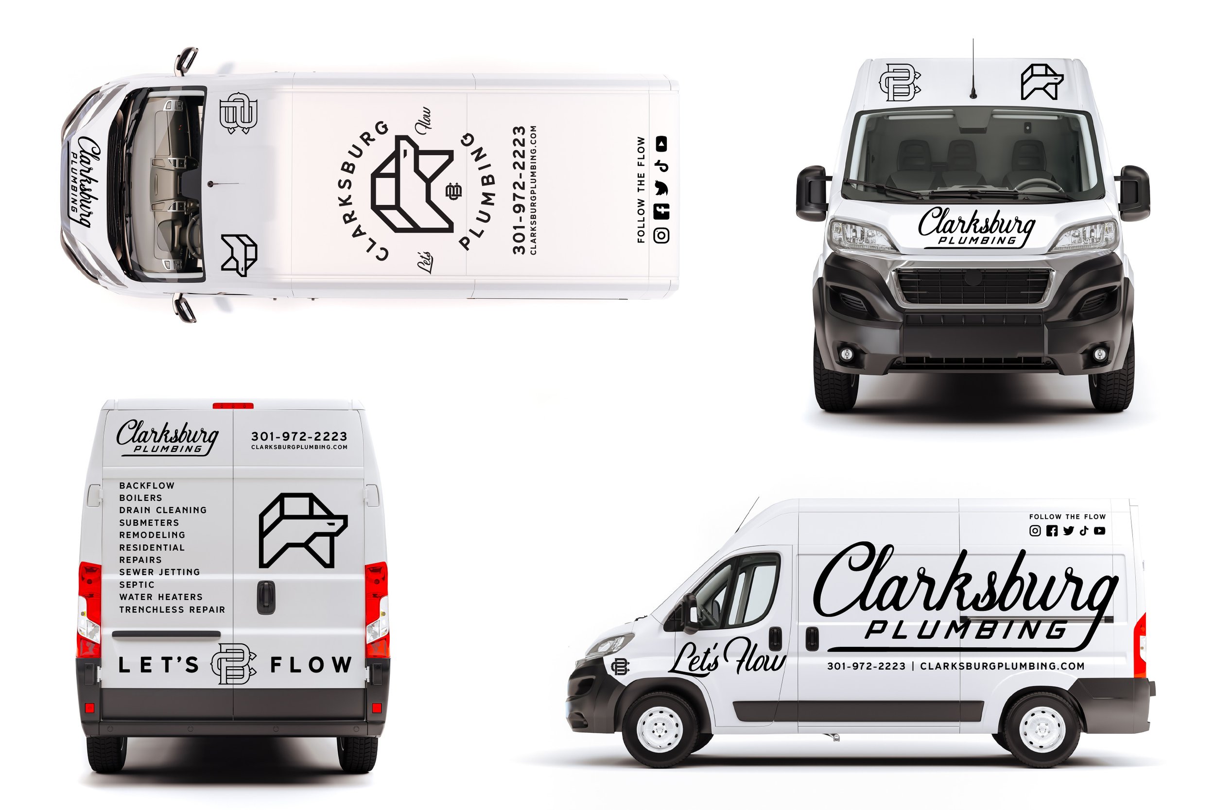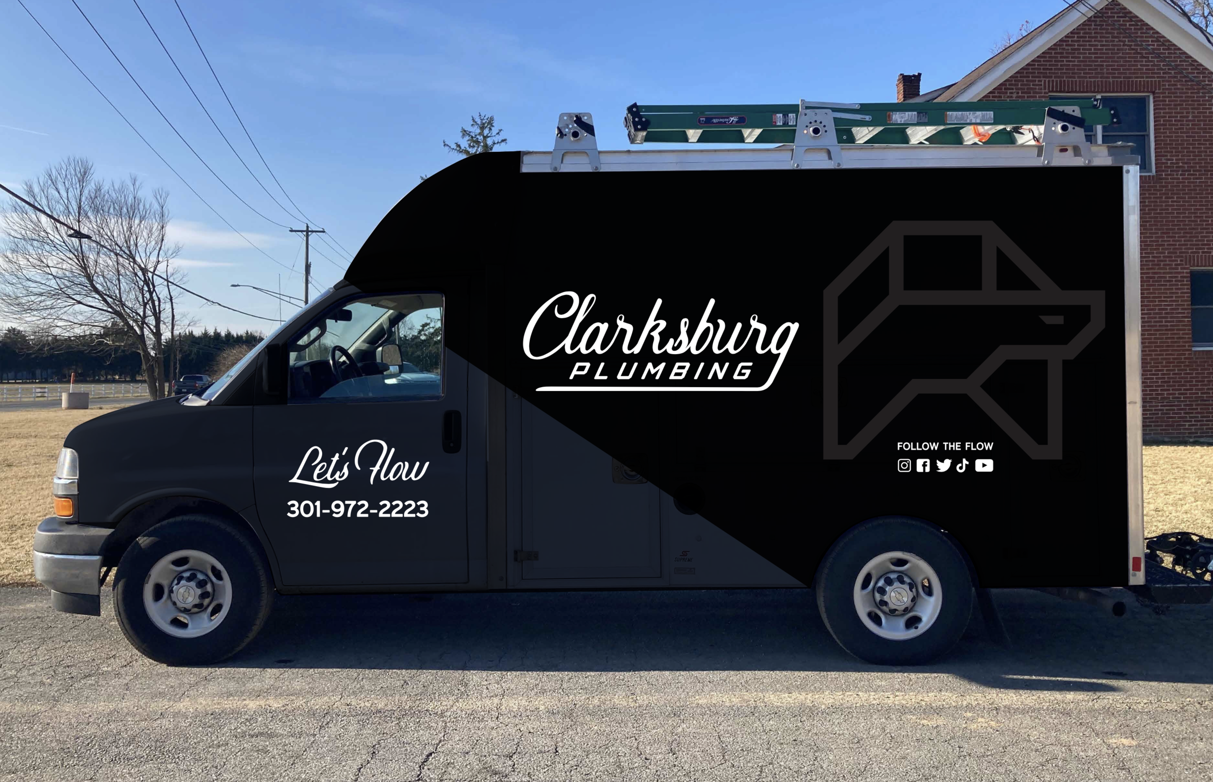
Helping Clarksburg Plumbing shine.
DELIVERABLES: BRAND STRATEGY + VISUAL IDENTITY SYSTEM + COMMUNITY ENGAGEMENT STRATEGY + SOCIAL MEDIA CONSULTING + MARKETING STRATEGY + CAMPAIGN CONSULTING + WEARABLES DESIGN + BRAND CONSULTING + BRAND COACHING + MINDSET COACHING
All pipes need to flow
Clarksburg Plumbing from Clarksburg Maryland hired Made X Maker to help them discover their greater purpose and connect with their community. This included a “Branding Blueprint,” a full brand strategy, brand positioning, purpose statement, visual identity, tagline development, brand deployment and consulting, as well as an eventual website overhaul ~ in progress as of 3/2022.
The Challenge
Owner Katie Byrd and husband JR have plumbing in their veins. With both of their grandfathers working in the industry, it was almost written in the stars that they would continue the legacy of trustworthy plumbing work in their hometown.
The biggest challenge facing Katie and JR wasn’t getting customers, or getting glowing reviews, but a worldwide pandemic that threatened to shut them down. They were so focused on trying to get and do the work that they had no idea how to stand out.
After seeing some branding content that Mario put out about a shared interest he and katie have: Street Parking Fitness, Katie was struck that she wanted to be known for building community and having a stronger brand presence, and not just for being a good plumber. She wanted more from her brand, she wanted to make an impact.
Right in the midst of the pandemic, Katie was worried about investing in her brand, but she knew it was the only way for them to truly build the company she dreamt of. Made X Maker conducted a full Brand Blueprint to show CBP where they were and the opportunities they had to grow, this led the team to do an in depth strategy workshop that helped clarify their customer profiles, purpose, mission, positioning, and helped Clarksburg see the bigger vision Katie knew was there all along.
The Solution
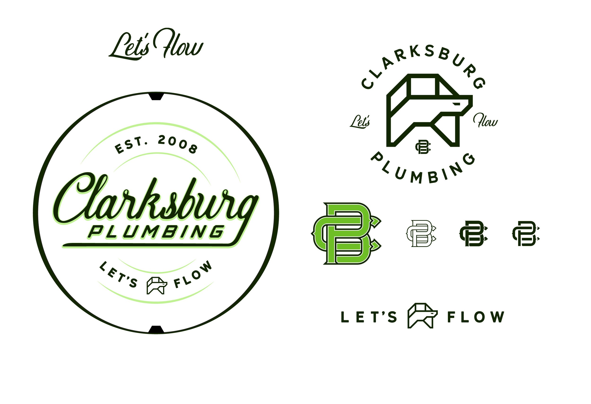
After really diving in deep to the heart of CBP, we helped them discover a renewed focus, their true purpose, competitive research, content structure, as well as focusing on the heart and soul of CBP and what makes them shine, we were able to then craft a brand new identity for them that brought to life the plumbing legacy and proud blue collar lineage that they desired to reveal.
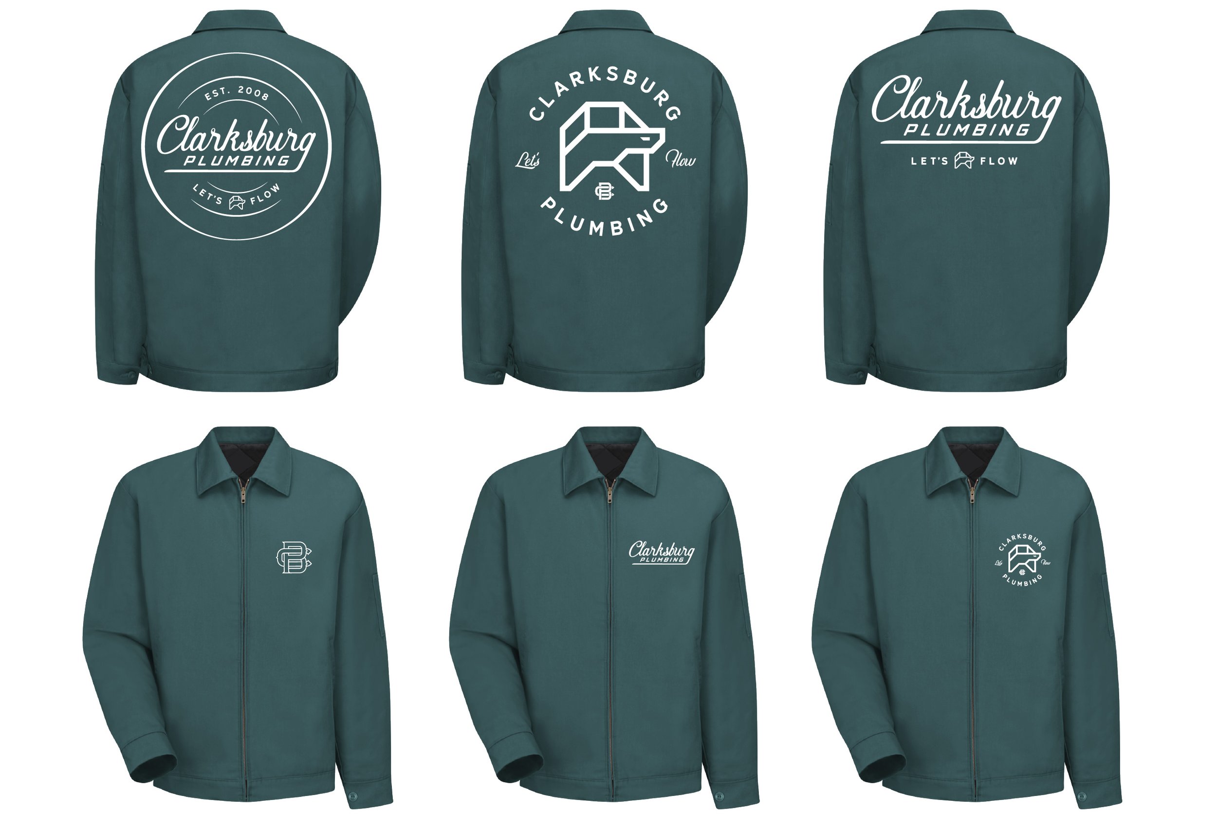
We didn’t simply craft a new logo, or color scheme, or “turtle” - *read below, we gave them a true visual extension of the heart and soul of who they were.
In order to dig out who Clarksburg Plumbing was at their heart, and why they felt so strongly that they wanted to do things right and for the right reasons, we had to go into the heart of the owners Katie and JR.
As we uncovered more about who they are, and the heart they have for their community, we found that they wanted everyone to succeed. They saw themselves as part of the bigger community picture and wanted to give of themselves so that everyone could keep growing.
Katie and JR didn’t just want to be good plumbers, they wanted to be the best for their community. They wanted to help their community keep running smoothly, so that all good things for everyone could “flow”, like good plumbing should. So that became their invitation to their community: Clarksburg Plumbing, Let’s Flow.
What’s with the turtle?
A turtle may be a strange mascot for a plumbing company, unless you’re of the teenage mutant ninja kind... The story behind the turtle and why it was a necessary icon to remain part of their identity, was that JR learned plumbing from his grandfather, and when he was a boy they used to catch and play with turtles in their fun time. When it came time for JR to start a company of his own, his grandfather loaned him the startup money, and JR honored him by using a turtle as his logo.

